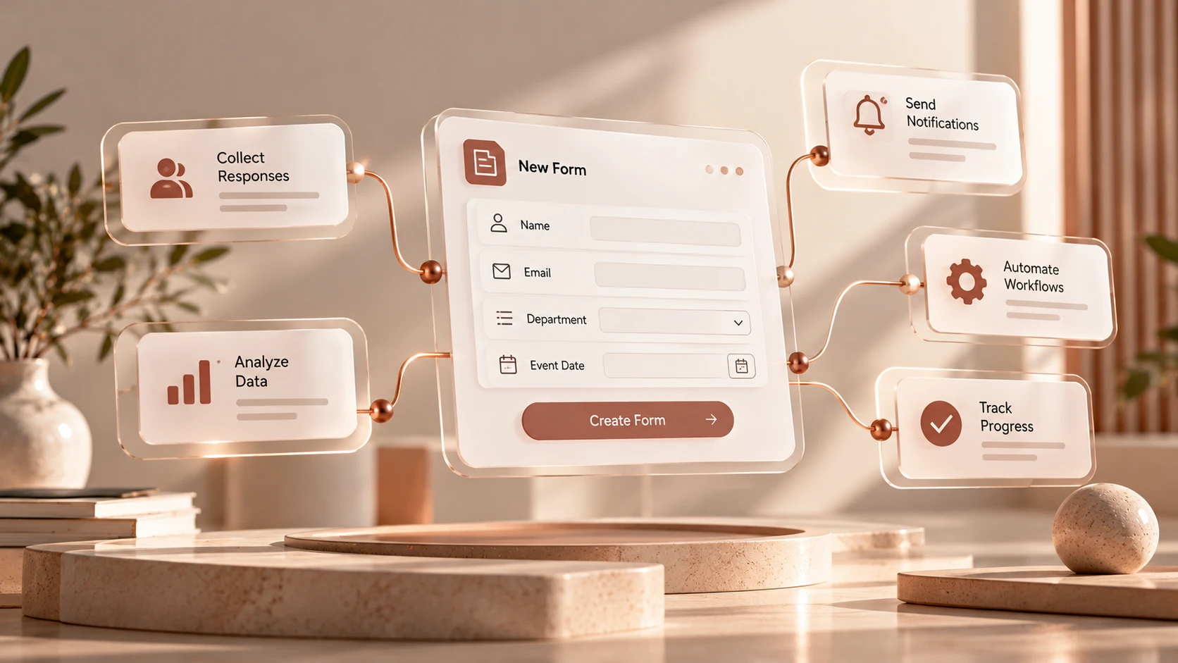
Form DesignFormsClarity
How to Design Better Online Forms
Practical ways to make questions clearer, reduce unnecessary effort, and collect information people can confidently provide.

People arrive at a form with a task, not a desire to fill in fields. A thoughtful form respects that task. It asks for information in an understandable order and makes the next step clear.
Define the minimum useful answer
For every question, ask who will use the answer and what they will do with it. If nobody can explain its purpose, remove it or make it optional. A shorter form is not automatically better, but unnecessary questions always add work.
Explain the purpose of the form before the first field. Include what someone needs to prepare, without promising a response time unless your team can reliably meet it.
Ask one thing at a time
A question such as “Was the process quick and easy?” mixes two ideas. Someone may have found it quick but confusing. Ask about speed and clarity separately if both answers are needed.
Prefer familiar language over internal terminology. If a specialist term is necessary, explain it briefly beside the question.
Choose an answer format deliberately
Use fixed choices when the range is known and consistency matters. Use a written response when the answer requires explanation. Do not ask someone to write a paragraph when a simple selection would provide all the information you need.
A useful review checklist:
- Does the question have one clear interpretation?
- Can the intended audience reasonably know the answer?
- Are the choices distinct and understandable?
- Is an “Other” option needed for exceptions?
- Is a required answer truly essential?
Make the form understandable beyond appearance
A field needs an accessible label, not just text that disappears when typing begins. Error messages should identify the problem and explain how to correct it. Keep related instructions close to the field they describe.
Review keyboard navigation and the reading order on a narrow screen. Long labels should wrap naturally. A decorative layout should never make the question harder to read.
Test with a realistic task
Ask a colleague who did not design the form to complete it using a realistic example. Watch where they hesitate and ask which questions required a guess. The most useful improvements often come from a few unclear words.
After launch, revisit the form when the team's needs change. Treat it as a working conversation rather than a document that can never be revised.